

My Role
Interaction Designer - competitive research, visual design, interaction design, information architecture
Tools
Sketch
FigJam
Powerpoint
Framer
Team
Designer
Timeline
1 Month
At A Glance
Express wanted to "match" their UI to Aritzia, Revolve and some other high end brands to see if they moved to a more elevated style would it yield a higher quality brand recognition or increase ATC rate
Some Stats
20%
projected increase of brand recognition
32%
projected ATC rate increase
26%
projected lowered bounce rate
"Customers who are dissatisfied with a website’s information content will leave the website without making any purchases"
"Great UI doesn’t just look good—it builds trust, drives engagement, and elevates your brand above the noise."
Research
Starting Point
Express was hoping to see what an elevated UI style would look like for the brand.
Next Step
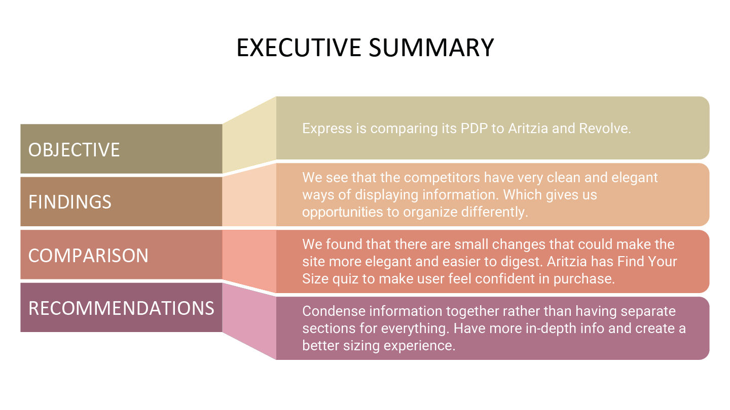
Express wanted to compare against Aritzia and Revolve. I next went to screenshot their PLP & PDP experiences, I went on to create how Express' PDP would look if I put their data into each of the competitors experience. From there I pulled out which parts felt correct for the brand and created a new elevated experience.


"Retailers must change the way they think about and build their brands, or face extinction."
"As much as customers are interested in prices, service quality and ambience conditions, they also take into consideration the convenience offered by the location."
Challenges
To elevate Express’s UI effectively, we must solve for key challenges like preserving brand identity, meeting user expectations, and balancing design upgrades with technical performance.
01
A high-end UI could feel off-brand for Express if it strays too far from their current identity.
02
Users on high-end fashion sites behave differently. Express users are slightly more price-conscious and deal-driven.
03
A more premium UI might boost brand perception but slow down decision-making.
04
Premium UIs often require heavier development and can impact site performance.
Design
Concept Project
With this project it was more of concepts and comparison that is why you dont see a ton of design


Solution


We wanted to create a system of recognition for the user. User-testing told us that the color-coded system made it easier to see and understand where they would be picking up their order.
Changed the data structure for when a store isn't available it shifts to the next closest store to their location.
We wanted to create a system of recognition for the user. User-testing told us that the color-coded system made it easier to see and understand where they would be picking up their order.
Wanted to make sure we were communicating this in as many places that made sense.
Solution
We wanted to create a system of recognition for the user. User-testing told us that the color-coded system made it easier to see and understand where they would be picking up their order.
Next Project:
Logos
